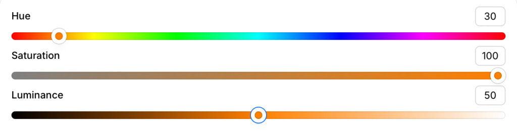
HSL stands for Hue, Saturation, and Luminance. When picking colors that meet WCAG color contrast requirements, this system is often easier to work with than RGB or hex codes.
Most contrast checkers are based on HSL. You pick a hue, then adjust it by adding white, gray, or black. Here’s how those adjustments affect accessibility.
Hue
The base color—pure, bright, and untouched by lightness or darkness. Think of your basic Crayola set.
Also called: pure color, true color, color family
Hue + White:
Usually not accessible on white backgrounds.
Blue to purple hues are most likely to pass.
Hue + Black:
More accessible on black backgrounds.
But be careful—it can look harsh or over-saturated.

Saturation (Gray Added)
Saturation is the amount of gray in a color. It mutes or neutralizes the hue.
Also called: tone, desaturated color
Tone + Black:
Usually fails. Gray and black are too similar.
Tone + White:
Often passes! Muted colors tend to darken slightly and work better on light backgrounds.

Luminance (Light or Dark Added)
Luminance is how much white or black is added to a hue. That gives you either a tint or a shade.
Tint (Hue + White)
Also called: light color, pastel

Tint + White:
Almost never accessible.
Even bold colors like red or blue can fade into white.
Tint + Black:
Often accessible. High contrast makes black-on-pastel work.
Yellow Warning:
Yellow has very high luminance and is never accessible on a white background. Adding black can make it more readable—but it may start to look brown.
If your brand uses tints:
Don’t use them for text or links. Save them for backgrounds, accents, or illustrations.
Shade (Hue + Black)
Also called: dark color, deep color

Shade + White:
Perfect for accessibility. Shades are your go-to for body text and small text on light backgrounds.
Shade + Black:
Fails. Too little contrast.
Link Text Tip:
Be cautious. Dark shades used as link colors must still contrast with surrounding text and the background.
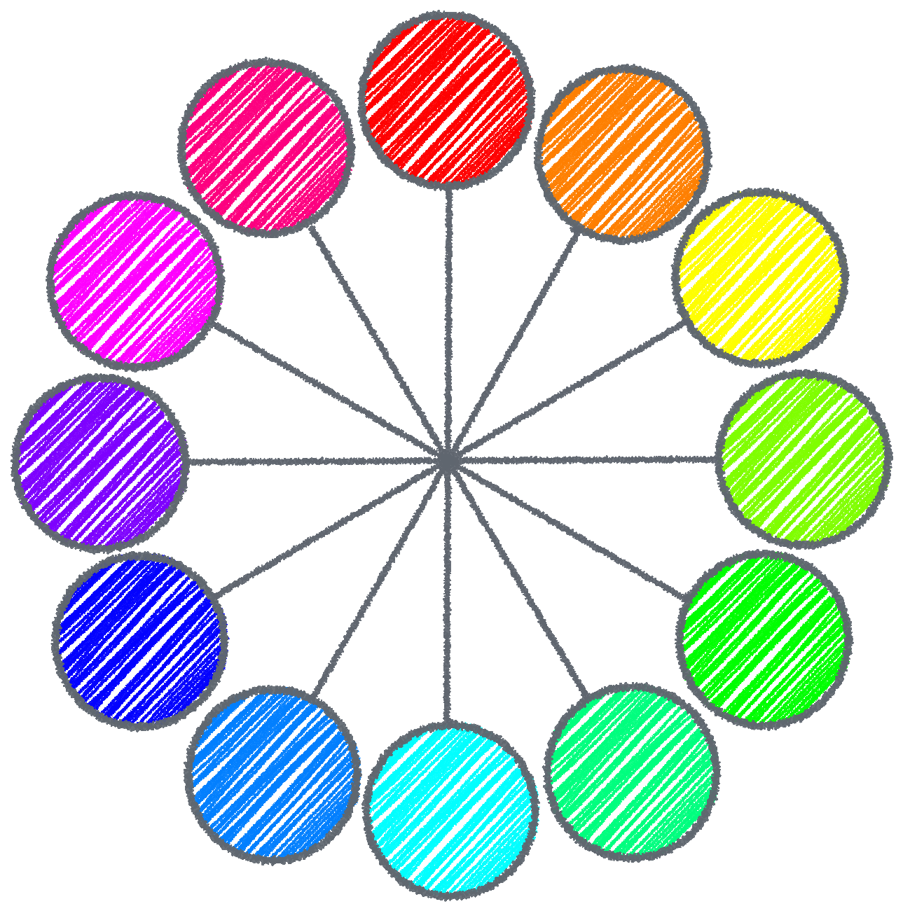
HSL Primary Color Code Chart
Here is a list of the color codes for hues in the basic color wheel. Use them as a starting point. Adjust the luminance and saturation to find accessible variations.
| Primary Hue | HSV | Hex | Web Name |
| Red | 0,100,50 | #FF0000 | Red |
| Orange | 30,100,50 | #FF8000 | Orange |
| Yellow | 60,100,50 | #FFFF00 | Yellow |
| Yellow-Green | 90,100,50 | #80FF00 | Chartreuse |
| Green | 120,100,50 | #00FF00 | Green |
| Green-Cyan | 150,100,50 | #00FF80 | Spring Green |
| Cyan | 180,100,50 | #00FFFF | Cyan |
| Cyan-Blue | 210,100,50 | #007FFF | Azure |
| Blue | 240,100,50 | #0000FF | Blue |
| Violet | 270,100,50 | #7F00FF | Violet |
| Magenta | 300,100,50 | #FF00FF | Fuchsia |
| Magenta-Red | 330,100,50 | #FF0091 | Magenta |